- Top
- Seminar list
- Do site analysis like this! Google Analytics Teppan Usage Seminar-Seminar Report
Do site analysis like this! Google Analytics Teppan Usage Seminar
Learn techniques and get good sales! Let's raise
~ Seminar Report ~
Seminar outline
theme
Do site analysis like this! Google Analytics Teppan Usage Seminar
-Learn techniques and increase sales! Let's raise it ~
Place
1-14-6 Dogenzaka, Shibuya-ku, Tokyo Humax Shibuya Building 7F
Teacher
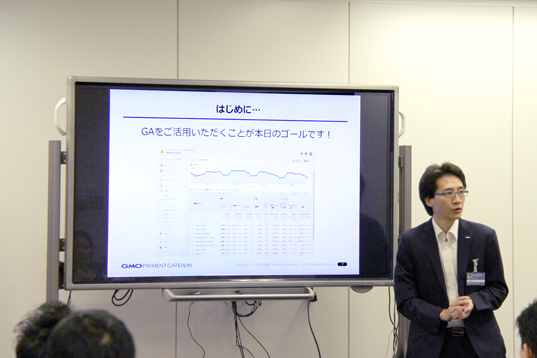
Yu Sugawara, Data Scientist, Customer Attraction Support Department, GMO Payment Gateway, Inc.
GMO Payment Gateway, Inc. Customer Attraction Support Department Analysis Analyst Ryuichi Tsujimoto
Overview
An access analysis tool that is almost always installed on every website.
However, the current situation is that there are surprisingly few companies that can make full use of that function and use it to improve the site.
- I want to improve my site using Google Analytics
- I can't analyze correctly because I haven't set it.
- I want to make the data easier to see and find site issues easily
We hold a seminar on how to use Google Analytics for companies with such issues.
Part 1 introduces the overall picture of analysis for improving the site and the basic methods.
In the second part. I explained the important settings of Google Analytics and the visualization of data.
【Part One】
Part 1 explains how to use Google Analytics to find a way to improve your site.
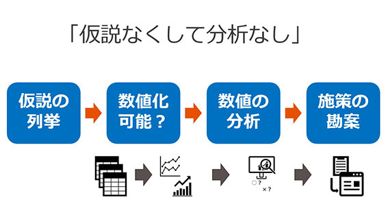
At the beginning, as an example of the hypothesis for analysis, "Garbage in, garbage out" (only "meaningless results" can be obtained even if "meaningless data" is input to the computer) is given as an example. He insisted that it was important to explore the challenges of the site rather than looking at the data, "without hypothesis, without analysis."
Next, verbalize and list the found issues and list hypotheses.
In addition, as a point to note at that time, he stated that the hypothesis must be quantifiable as data, and introduced common mistakes when formulating hypotheses.
Next, I will explain the overall picture of the analysis from the perspective of the components of the data.
- Data structure
The components of Google Analytics data are "dimensions" and "indicators"
Dimension = What (time axis / label)
Indicator = good / bad (numerical value)
Depends on.
In order to understand this data instantly and deeply, it is necessary to visualize = graph.
- Factorization
To analyze the outcome, factor the elements.
If your business goal is to increase revenue
Order amount = number of site visits (quantity) x purchase rate (quality) x purchase unit price (quality)
And factorize and analyze.
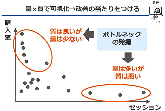
Amount: What is the breakdown of the ratio to the whole?
Quality: How much is the difference from the average value
From this perspective, find the element that is the bottleneck.
Finally, I introduced the basic method of analysis that is also used in the field, and concluded the first part.
- Secondary dimension (multiplication of multiple dimensions)
- 加重レポート(質×量の2軸で重要と考えられる指標の抽出)
- Trend analysis (comparison with past monthly / weekly data)
- Funnel analysis (finding points where there are many withdrawals between landing and goal)
[Part 2]
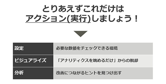
In the second part, as a point to be suppressed by analysis using Google Analytics,
I gave three actions of <setting, visualization, and analysis> and explained each of them.
At the beginning, I touched on the current situation that many companies have introduced Google Analytics but have not been able to utilize it.
Explains the importance of initial settings and the setting items that should be suppressed.
Why you have to make initial settings
- In the initial state as it is installed, the numerical value itself is incorrect.
- Important indicators required for analysis cannot be confirmed in the initial state.
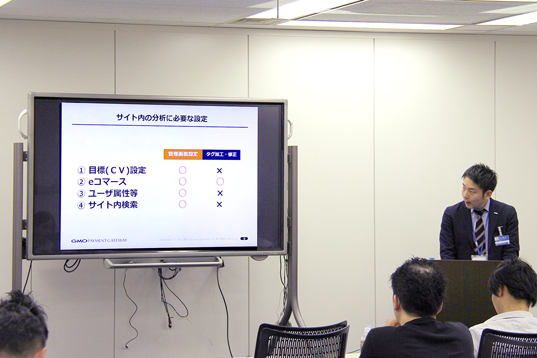
4 items to set
- Goal (CV) setting: Measure business objectives and outcomes
- E-commerce settings: to check sales amount
- User attributes: To clarify the target of the site and utilize it for marketing
- Site search: To visualize user needs
Next, the need to visualize the data,
I explained the tools I want to use.
Visualize in the analysis
He said that it is effective when he wants to quickly grasp changes in trends and numerical values.
We have introduced tools that are useful for each scene.
- Google data studio
Incorporate information from the management screen of advertisements such as Google AdWords and your own database,
It can be visualized on the dashboard.
From basic items such as sales, sessions, conversion rates, unit purchase prices, etc.
You can freely combine the transition of each data, the ratio of new users, the ratio by device, etc. and instantly graph them. - Heat map
Click, scroll, mouse movement, etc.
You can visualize what the user did on the page. - User explorer
It is possible to grasp and visualize the behavior of each user.
Finally, in the analysis part, the three steps of analysis
We explained KPI setting, problem finding, and factor analysis.
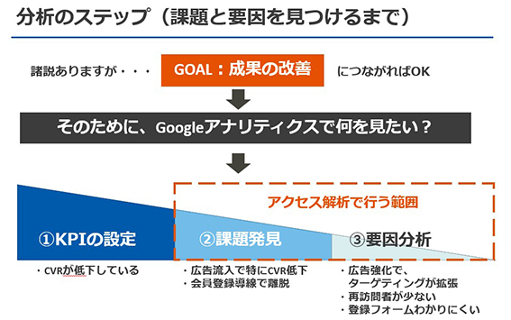
First of all, it is necessary to organize KPIs before starting analysis.
He emphasized that Google Analytics will be used from the subsequent stage of problem discovery.
Also, if you cannot find the issue, use the visualized data.
- Is there a point where the number drops significantly in a specific segment?
- Find points with many withdrawals by funnel analysis
I continued that it would be good to check the points such as.
To conclude, we introduced a practical analysis case.
- Analysis that leads to measures
Relationship between number of visits and CV ⇒ Guidance for revisit - Analysis that leads to awareness
User Explorer ⇒ revenue and analyze trends of top users
- Top
- Seminar list
- Do site analysis like this! Google Analytics Teppan Usage Seminar-Seminar Report
This service is applicable when the introduced EC site is operated by a corporation.
If the introductory EC site is operated by an individual, please check here.
