

Do site analysis like this! Google Analytics Teppan Usage Seminar-Learn Techniques and Make Sales Good! Let's raise it ~
~ Seminar Report ~
Seminar outline
theme
Do site analysis like this! Google Analytics Teppan Usage Seminar
-Learn techniques and increase sales! Let's raise it ~
Place
1-14-6 Dogenzaka, Shibuya-ku, Tokyo Humax Shibuya Building 7F
Teacher
Yu Sugawara, Data Scientist, Customer Attraction Support Department, GMO Payment Gateway, Inc.
GMO Payment Gateway, Inc. Customer Attraction Support Department Analysis Analyst Ryuichi Tsujimoto
Overview
An access analysis tool that is almost always installed on every website.
However, the current situation is that there are surprisingly few companies that can make full use of that function and use it to improve the site.
- I want to improve my site using Google Analytics
- I can't analyze correctly because I haven't set it.
- I want to make the data easier to see and find site issues easily
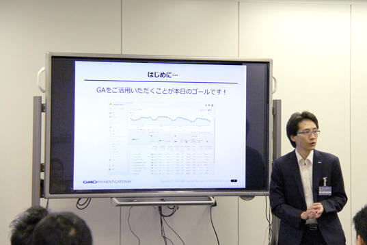
We held a seminar on how to use Google Analytics for companies that have such issues.
In the first part, we will introduce the overall picture of analysis for site improvement and the basic methods.
In the second part, we explained the important settings of Google Analytics and data visualization.
【Part One】
Part 1 explains how to use Google Analytics to find a way to improve your site.
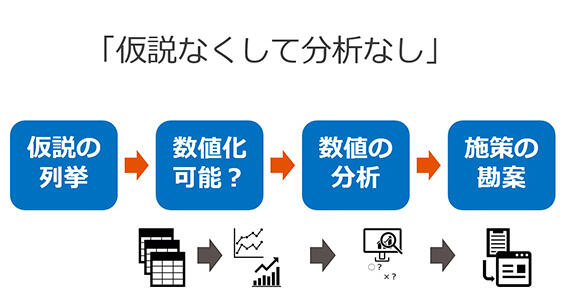
At the beginning of the session, he used the adage "Garbage in, garbage out" as an example for analysis, and emphasized that it is important to explore the issues of the site before looking at the data, and that "without hypothesis, there is no analysis".
Next, he verbalized and listed the problems found and enumerated hypotheses, and as a precaution at that time, he stated that hypotheses must be quantifiable as data, and introduced common mistakes when formulating hypotheses.
Next, I explained the overall picture of analysis from the perspective of the components of the data.
- Data structure: Google Analytics data consists of "dimensions" and "metrics", where the dimension is determined by "what" (time axis / label) and the metric is "good/bad (number)". In order to understand this data instantly and deeply, it is necessary to visualize (graph) it.
- Factorization: It is important to factor factors in order to analyze outcomes.
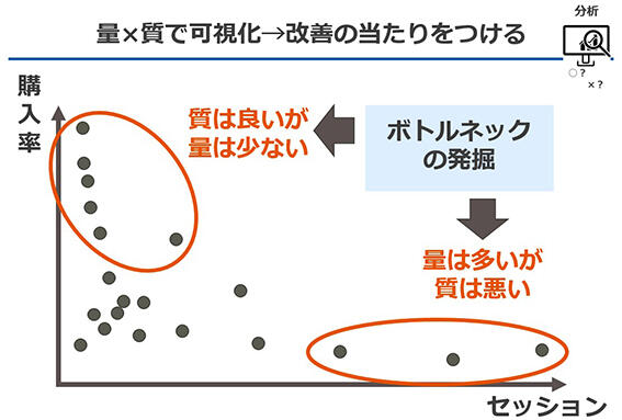
If your business goal is to increase revenue, factor and analyze order value = number of site visits (quantity), ×purchase rate (quality), × unit purchase (quality).
Volume: What is the breakdown of the percentage of the total?
Quality: How much of a difference is there from the mean?
From this perspective, we will find the elements that are bottlenecks.
Finally, we introduced the basic methods of analysis that are also used in the field, and concluded the first part.
- Secondary Dimensions: Multiplying multiple dimensions
- Weighted Reporting: Extraction of indicators considered important on two axes of quality × quantity
- Trend analysis: Comparison with historical monthly/weekly data
- Funnel analysis: Identify the most churnary points between landing and goal
[Part 2]
In the second part, we listed the three actions of "setting, visualization, and analysis" as points to be suppressed in analysis using Google Analytics, and explained each of them.
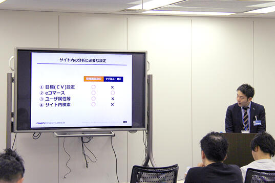
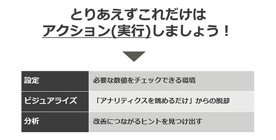
At the beginning of this article, I touched on the current situation where many companies have introduced Google Analytics but have not been able to use it, and explained the importance of initial settings and setting items that should be suppressed.
Why you have to make initial settings
- In the initial state as it is installed, the numerical value itself is incorrect.
- Important indicators required for analysis cannot be confirmed in the initial state.
4 items to set
- Goal (CV) setting: Measure business objectives and outcomes
- E-commerce settings: To see the amount of sales
- User attributes: To clarify the target of the site and use it for marketing
- Site search: To visualize user needs
Next, we talked about the need to visualize data and the tools you want to use.
Visualization is useful when you want to quickly grasp trends and numerical changes, and we have introduced useful tools for each scene.
- Google Data Studio: You can import information from the management screen of ads such as Google AdWords and your company's database and visualize it on the dashboard. From basic items such as sales, sessions, conversion rates, and unit purchase prices, you can freely combine the changes in each data, the ratio of new users, the ratio by device, etc., and instantly graph it.
- Heatmaps: Visualize how users interact with the page, such as clicks, scrolls, and mouse movements.
- User Explorer: You can grasp and visualize the behavior of each user.
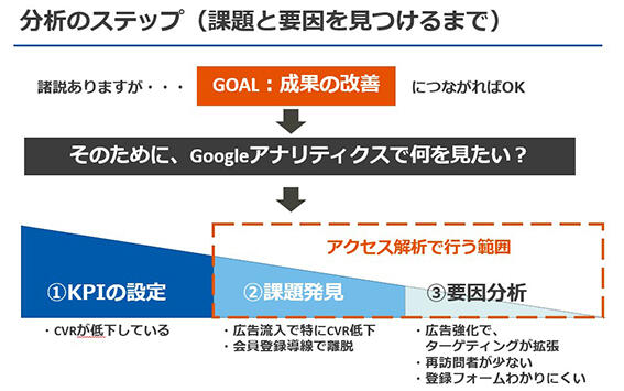
First of all, he emphasized that it is always necessary to organize KPIs before starting the analysis, and that the use of Google Analytics is from the stage of finding issues after that.
And when you can't find an issue, it's important to check the following in the visualized data:
- Is there a point where the number drops significantly in a specific segment?
- Find points with many withdrawals by funnel analysis
In closing, we introduced practical analysis examples.
- Analysis that leads to measures: Relationship between number of visits and CV ⇒ Inducing repeat visits
- Insightful Analytics: User Explorer ⇒ Sort users by revenue and analyze trends in the top users