EC Growth Institute
Article published:
What should I do about cart dropping measures at the "purchase entrance" and "cart screen"? Introducing actual site renovation examples
Key points of this article
- We will explain specific improvement methods for cart screens to prevent "cart falls".
- Organize the challenges of conductor design that lead to unintentional user churn.
- Learn from actual site renovation examples and present iron rules for increasing purchase rates.
INDEX
Petit renovation, the first thing you should start with is the "purchase lead"
Last time, we recommended the "purchase line", which is a group of pages after the cart consisting of elements such as "cart", "customer information input", "payment method selection", and "confirmation screen", as a target for small renovations that should be introduced before a large-scale renovation (renewal) of the e-commerce site.
▶ For details, please also see the second installment, "First of all, from the "purchase lead": Petit renovation of the customer information input page"!
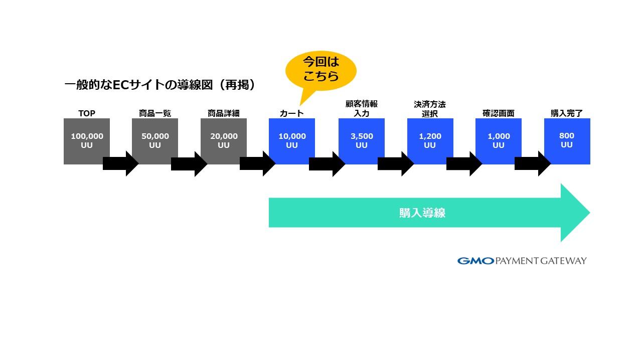
In the purchase lead, by making small repairs in order from the "Purchase Completed" screen = CV (Conversion) screen → the screen close to the conversion screen, such as "Confirmation Screen"→ "payment Method Selection", "Customer Information Input", etc., effectively CVR (Conversion Rate): Conversion rate).
Last time, we introduced a case study of a small renovation of the "Customer Information Input Field", so this time we will introduce the issues and actual renovation examples of the "Cart" screen, one before the "Customer Information Entry" screen.
Many people may consider the "cart" screen to be important as a key to preventing cart drops. The "Cart" screen is the entrance to the purchase line, so it is necessary to design the product so that users who are considering the product can proceed with the procedure immediately when they want to purchase it.
However, there are various methods to "prevent abandoned baskets", and it is necessary to consider the method that suits each e-commerce site for specific countermeasures. Here, we will tell you about actual renovation examples and how to proceed from the perspective of improving the e-commerce site.
Problems with the "cart" screen and small repair points for cart dropping countermeasures
First, we will introduce some common issues that we have seen in helping customers with small repairs.
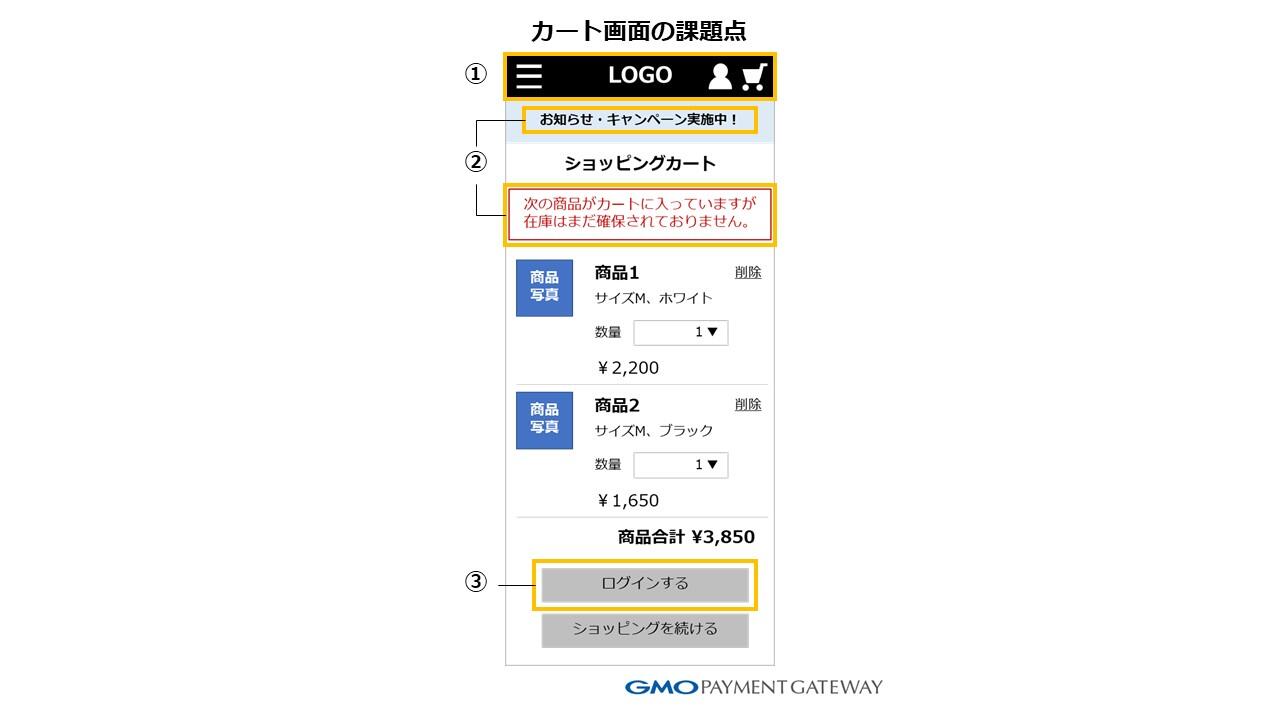
The image above is a diagram of the cart design before the renovation on the customer site where we helped with the small renovation.
There are many cases where your cart is designed like this on your e-commerce site. From the perspective of preventing basket falling, let's first focus on the following three small repair points.
(1) Are there any leads that cause users to leave?
There are parts where links are installed by common templates of e-commerce systems, such as the header logo, navigation, and footer. These links cause a certain percentage of users to accidentally leave the purchase lead.
As a countermeasure, it is desirable to make minor repairs such as hiding the header icon or cutting the logo link.
(2) Is there any information that can confuse users?
What you need to pay attention to on the "Cart" screen is the content of the information you show to the user.
In this image, there is a "Campaign in progress!" banner right below the header, but if the campaign is not for all users, users may be discouraged from making a purchase to see if they are eligible for the campaign.
To avoid this situation, it is considered a good idea to hide the campaign banner itself with a small renovation so as not to reduce the motivation to purchase once it has increased. (However, it is recommended to add the phrase "campaign applied" or display individual products as "campaign eligible products" through small renovations, as they will of course encourage purchases.) )
You should also be wary of things that are unclear about the actions users should take, such as the wording in red letters.
In this case, showing users how to secure inventory makes it easier to lead to purchase actions. Therefore, it is better to correct the wording "We will secure the stock after receiving the order, so please purchase it as soon as possible."
(3) Is there a clear line for proceeding with the purchase procedure?
In the example of the e-commerce site, you can log in after registering as a member before purchasing products, so the link button to proceed with the purchase procedure says "Login". However, this is especially difficult for new users to understand, and the buttons themselves are gray achromatic and inconspicuous, so it is thought that there will be quite a few users who overlook them.
In this regard, the effect of improving CVR can be expected by modifying the wording of the link button to "proceed to the purchase procedure" and then coloring it with the image color of the e-commerce site.
So far, we have looked at the points that tend to be issues with the "cart" screen, but if there are any points that apply to your e-commerce site, we hope it will be helpful.
Next, I would like to introduce a small repair case of basket fall prevention that we actually helped with.
Minor renovation of the "Cart" screen (1) Cutting of exit and unnecessary information and clarification of purchase leads
The first is an example of a small renovation based on the three issues mentioned above.
Let's take a look at this as a diagram of the cart design.
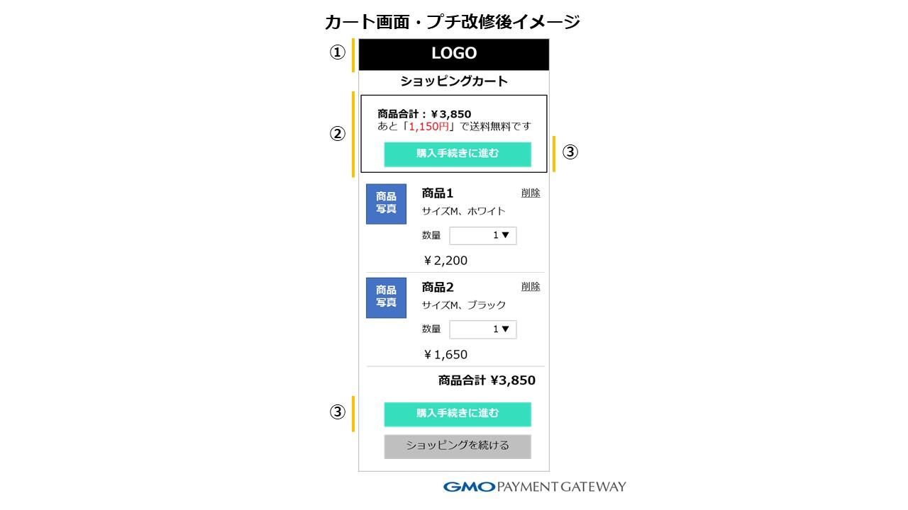
(1) In order to prevent users from accidentally leaving, we have hidden the icon and disabled the A tag (a description to display links on the page) to minimize links to other pages, mainly in the header and footer.
(2) The part where the campaign banner and cautionary note were written directly below the header was deleted, and the total price display of the products in the cart and the purchase procedure button were installed. This small renovation also eliminated the problem that the button to proceed with the purchase procedure was moved to the bottom as the number of products in the cart increased.
(3) The purchase procedure button is prominent with the brand's image color, and the wording is changed to "proceed to the purchase procedure". Guidance to the purchase lead has been strengthened.
AB tests were conducted on two patterns, the old screen before the renovation and the new screen after the renovation, and verified based on the number of CVs, unit price of orders, and sales amount.
As a result, the unit price of the new screen increased, and the sales amount increased by about 5%. It was decided to renovate the screen.
Petit renovation of the "cart" screen (2) Appeal to points that will encourage purchase
Another point, I would like to introduce a small renovation that was effective in preventing basket falling. This is an example of an e-commerce site that has introduced a point system and promoted points on the "cart" screen.
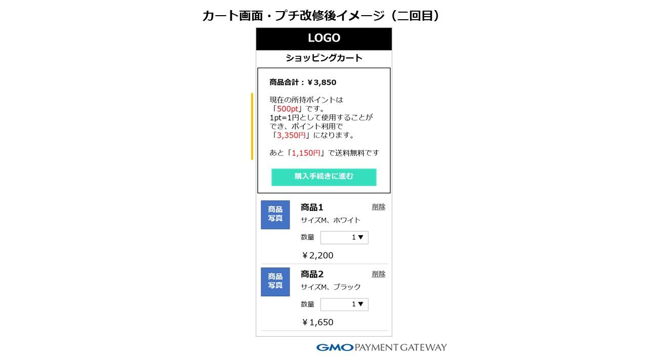
The image above is an example of a second petit renovation that appeals to the points after the three minor renovations I made earlier.
There is an issue that the point system is not being recognized on this e-commerce site, and an explanation of the use of points has been added in the second small renovation. The purpose is to clearly indicate the current points held and the price after using the points to encourage users to purchase.
If there is a system that allows free shipping for a certain amount or more, it is recommended that you promote free shipping as it can be expected to improve CVR.
As with the first renovation, we conducted an AB test with two patterns: the old screen before the renovation and the new screen after the renovation. As a result, we were able to achieve results that exceeded the sales amount by about 5% again, and we also decided to renovate the screen.
Through two AB tests, compared with the old screen before the small renovation, the new screen after the renovation was "1.05 × 1.05 = 1.1025", which means that sales could be increased by about 10%. In this way, even if the number that can be improved with just one small renovation is small, you can see that repeating the number of times will lead to great results.
Above, this time, from the perspective of site renovation, we have told you about small repair examples as a countermeasure against falling carts.
[Next time preview]
Next time, I will tell you about the small repair of the "circulation conductor before the purchase conductor". While the purchase guide after the "cart" screen is basically a single path, the circulation guide allows users who visit the e-commerce site to freely go back and forth between pages. We will introduce what kind of issues there are in such a circulation line and how to take countermeasures, with examples as before.
*This content is a re-edited version of the article "Effective for sales growth!
*The copyright of this content belongs to GMO Payment Gateway, Inc..