EC Growth Institute
Article published:
"Petit renovations" before large-scale renewal of e-commerce sites are important

Key points of this article
- We will explain why you should start with the input screen, which is likely to be the biggest bottleneck.
- Here is an example of how optimizing input forms improved results by 3.3 times.
- We have summarized specific improvement measures to prevent user churn and increase CVR.
INDEX
Hello. GMO Payment Gateway, Innovation Partners Division Marketing Department This is Takahata from the Site Improvement Team.
We are a company that provides comprehensive payment services and finance-related services that allow companies to introduce Credit card payment, CVS Payment, etc. in one go. As an "innovation partner", we develop our business every day to support the growth of our customers' businesses.
Among them, we at Marketing Department handle a number of services that mainly contribute to the growth of the e-commerce business, from attracting customers to e-commerce sites to analysis and improvement, so that we can grow together with our customers and provide better services to our customers.
In this series, we have been involved in EC In the site growth support project, The importance of "petit renovation" and specific examples I would like to introduce you to.
What is a small renovation of an e-commerce site that can be done right now?
First, I will explain what a small renovation is. Petit renovation refers to "e-commerce site improvement without large-scale changes such as tweaking the cart system or redesigning it." Specifically, it refers to renovations using "AB testing tools" such as Google Optimize and Optimizely, and "customer service tools" such as KARTE and Flipdesk.
Why do we recommend petit renovations?
Some people may be thinking, "I know I should do it, but is it that effective?"
The following graph shows the e-commerce revenue growth of two apparel companies that we have helped. In both cases, sales in the tens of millions of yen in 2015 when the support was first provided have increased by about four times in November 2021.
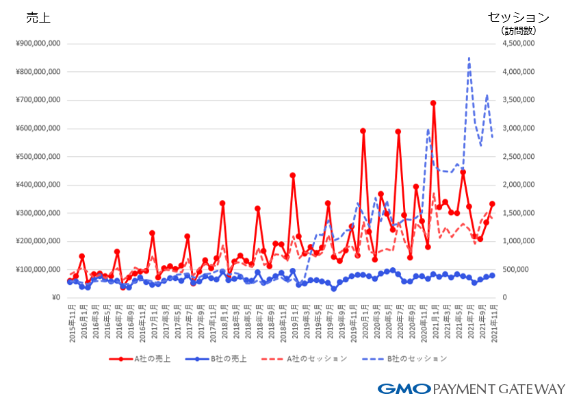
What contributed to this difference was the presence or absence of small renovations.
Company A (red line) had been improving sales by increasing advertising costs until around 2018, but felt that the growth of CVR (Conversion Rate) was limited, so it gradually renovated the site and introduced customer service tools sequentially. As a result, customers who flow into the e-commerce site can make purchases efficiently, which is directly linked to sales.
On the other hand, Company B (blue line) had more traffic than Company A, but it did not take measures to harvest it very frequently. The difference in frequency is partly due to the difference in sales growth.
In this way, in order not to waste the advertising and SEO costs you have already spent and to accumulate results, you need to review your e-commerce site in detail. Therefore, we recommend "small renovations".
How to start a small renovation
Let's start with an analysis of the current situation. If you look at the transition rate from a general e-commerce site to the next screen as a single flow from inflow to purchase, there are many points where there are many drop-offs. Identify the screen that is this bottleneck and why the user is not moving forward? We will think about it and take measures.
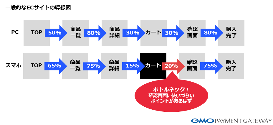
In the case of the EC site in the figure above, the smartphone version is lower than the PC version of the "Transition rate from cart" to confirm the purchased product and proceed to the purchase procedure.
When I looked at the actual smartphone version of the cart page, I saw that there were many leads in the narrow screen, and the button to proceed to the purchase procedure was buried. So, when we used Google Optimize to make the action button of the procedure that transitions from the cart page to the next page prominent, we were able to improve the CVR.
By taking this approach in detail, CVR will definitely improve.
From the next time onwards, what kind of problems did you actually have on the page and how did you improve the UI? We will introduce the flow of actual improvement and the implementation image.